Don’t you just love love love this time of year?
The temperature is slowly beginning to rise and morning are brighter. This is the time of year people start to gain a little inspiration to start getting ready for summer.
What does Spring look like this year? We’re going back to nature. We are all appreciating the colours found naturally in NATURE!
The colours popular this season evoke emotions to memories associated with these particular colours.
The primrose yellow reflects warm sunny days, can you picture that moment now?
Do you recall those crystal clear blue waters from your trip to the Greek Isles or your Instagram feed? Island paradise is another colour in the top ten this spring capturing our desire to escape to pristine waters.
Spring is the time of year our country goes from brown to green! All Australians in recent times have grown to love kale, but kale is also a trendy colour of this season, invigorating the feeling of breathing in fresh air, picture an endless valley of luscious green leaves.
Are you excited about spring?
Here is the full list of top colours of Spring 2017:
Niagara: Classic denim like blue. Double denim seems to be sticking around but don’t be afraid to add a pop colour eyeliner!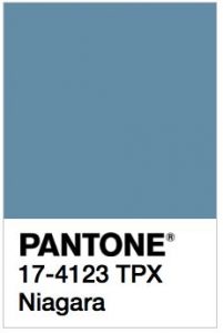
Primrose yellow: The joyful shade of yellow. An easy colour to accessories with.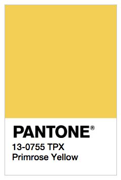
Lapis blue: An energetic colour, it is an intense blue shad.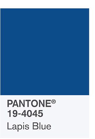
Flame: Red based orange! A perfect shade for you lips. Remember there is a perfect red for everyone. Read our tips on finding your shade of red here.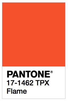
Island paradise: A cool blue green shade, try a shadow?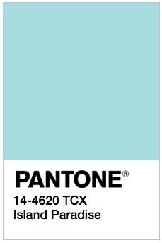
Pale dogwood: Sounds a little unusual but it is a peaceful pink shade that is a subtle pink with a soft touch infuses a healthy glow. A little blush or lips would be perfect if the flame red isn’t for you.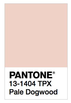
Pink Yarrow: On the contrary is BOLD, attention grabbing and tempestuous. It is a captivating and stimulating colour that lifts the spirit and gets the adrenaline going! We say active wear, cheeks, eyes and lips! This colour inspires many options.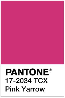
Kale: Reflective of beautiful great outdoors it is a natural, luscious and fertile natural green shade that is a perfect complementary background colour to more vibrant tones in the palette.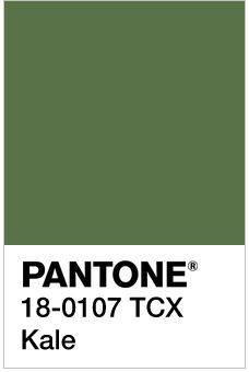
Hazelnut: If you thought Nutella, you’re wrong or was that just me? Hazelnut is a key neutral for spring. It is an unpretentious shade and effortless. This is the ideal highlighter or nude lip shade.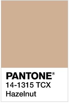
The key to this season? Be bold! The colours complement one another and bring a little fun and playfulness.
Mix and match!
But be mindful of your skin tone, read our tips on figuring out which tone you are and what colours would work for you here.
For a, thorough skin consultation or a colour matching session with an experienced team member:
Call: 02 8897 0000
Email: [email protected]